Connect Mean Points of Error Bars in ggplot2 Plot in R (Example Code)
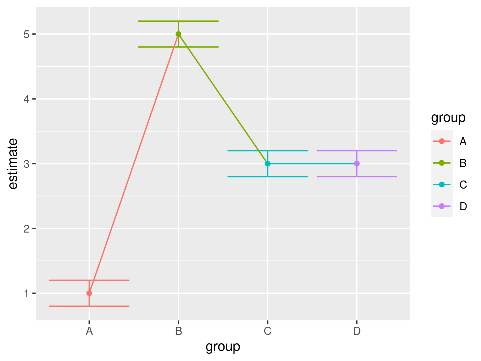
This post illustrates how to draw a graphic where the mean points of error bars are connected in the R programming language.
Creation of Example Data
my_df <- data.frame(group = LETTERS[1:4], # Constructing example data estimate = c(1, 5, 3, 3)) my_df$low_CI <- my_df$estimate - 0.2 # Make up confidence intervals my_df$upp_CI <- my_df$estimate + 0.2 my_df # Display example data in RStudio console # group estimate low_CI upp_CI # 1 A 1 0.8 1.2 # 2 B 5 4.8 5.2 # 3 C 3 2.8 3.2 # 4 D 3 2.8 3.2 |
my_df <- data.frame(group = LETTERS[1:4], # Constructing example data estimate = c(1, 5, 3, 3)) my_df$low_CI <- my_df$estimate - 0.2 # Make up confidence intervals my_df$upp_CI <- my_df$estimate + 0.2 my_df # Display example data in RStudio console # group estimate low_CI upp_CI # 1 A 1 0.8 1.2 # 2 B 5 4.8 5.2 # 3 C 3 2.8 3.2 # 4 D 3 2.8 3.2
Example: Drawing Error Bars with Connected Points Using ggplot2 Package
install.packages("ggplot2") # Install & load ggplot2 package library("ggplot2") |
install.packages("ggplot2") # Install & load ggplot2 package library("ggplot2")
my_plot <- ggplot(my_df, # ggplot2 plot with error bars and connecting lines aes(x = group, y = estimate, col = group, group = 1)) + geom_errorbar(aes(ymin = low_CI, ymax = upp_CI)) + geom_line(aes(x = 1:nrow(my_df), y = estimate)) + geom_point() my_plot |
my_plot <- ggplot(my_df, # ggplot2 plot with error bars and connecting lines aes(x = group, y = estimate, col = group, group = 1)) + geom_errorbar(aes(ymin = low_CI, ymax = upp_CI)) + geom_line(aes(x = 1:nrow(my_df), y = estimate)) + geom_point() my_plot

Further Resources & Related Tutorials
Please find some related R programming tutorials on topics such as descriptive statistics and lines in the following list.
