How to Draw a Barplot in R (5 Examples)
This tutorial illustrates how to create a barchart in R programming.
I will explain how to plot barplots using Base R as well as using the ggplot2 add-on package. Furthermore, I’ll demonstrate how to draw stacked and grouped barcharts.
Let’s start right away!
Construction of Example Data
Before all else, let’s create some example data in R.
df1 <- data.frame(values = c(5, 2, 7, 2), # Create example data frame group = LETTERS[1:4]) df1 # Print example data frame # values group # 1 5 A # 2 2 B # 3 7 C # 4 2 D |
df1 <- data.frame(values = c(5, 2, 7, 2), # Create example data frame group = LETTERS[1:4]) df1 # Print example data frame # values group # 1 5 A # 2 2 B # 3 7 C # 4 2 D
As you can see based on the previous RStudio console output, our example data is a data frame containing four rows and two columns. The variable values has the numeric class and the variable group is a character.
Example 1: Create Barchart Using Base R
In this example, I’ll show how to draw barcharts using the basic installation of the R programming language.
If we want to create a Base R barplot with default specifications, we can apply the code as shown below:
barplot(values ~ group, # Draw Base R barplot df1) |
barplot(values ~ group, # Draw Base R barplot df1)
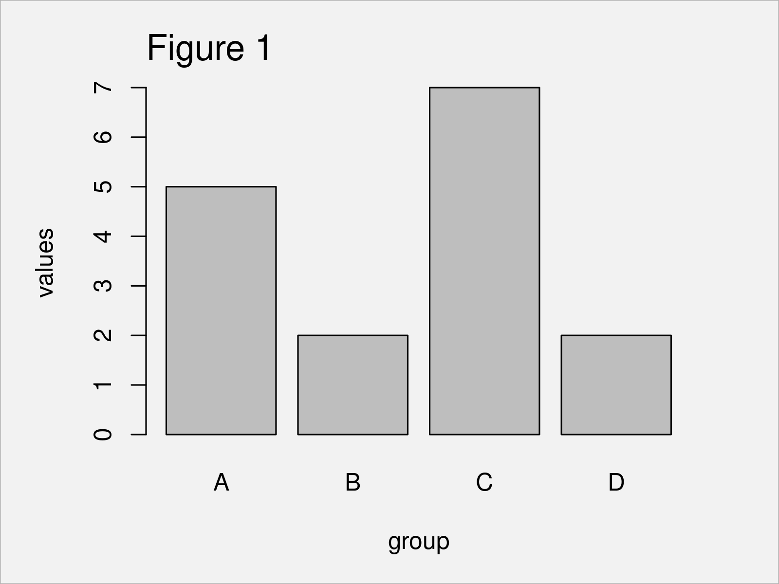
As shown in Figure 1, we have created a bargraph with vertical gray bars.
We can modify the alignment of the bars using the horiz argument:
barplot(values ~ group, # Horizontal barplot df1, horiz = TRUE) |
barplot(values ~ group, # Horizontal barplot df1, horiz = TRUE)
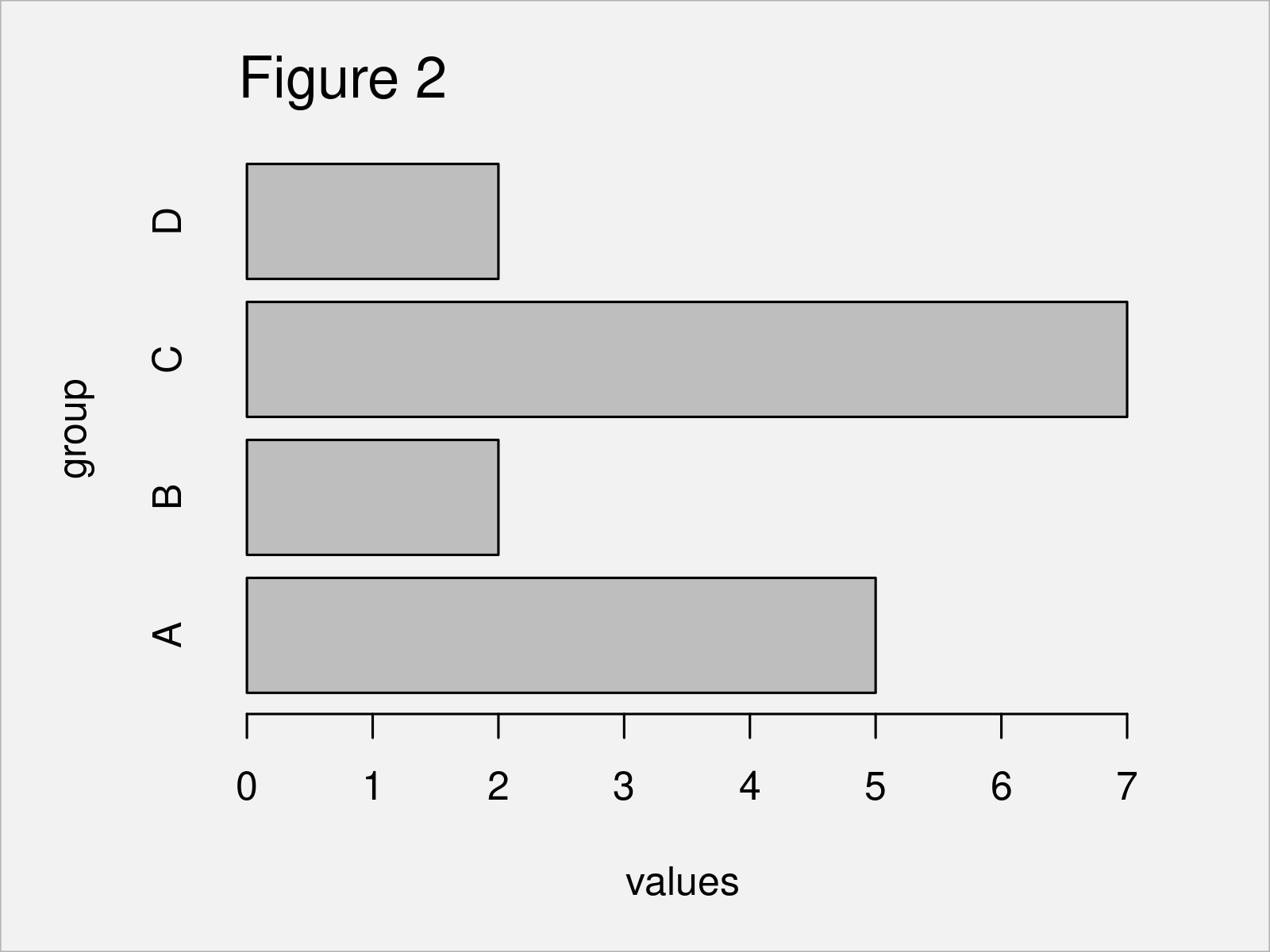
By executing the previous R code, we have created Figure 2, i.e. a barplot with horizontal bars.
We can also change the colors of our barplot:
barplot(values ~ group, # Barplot with colors df1, col = 1:4) |
barplot(values ~ group, # Barplot with colors df1, col = 1:4)
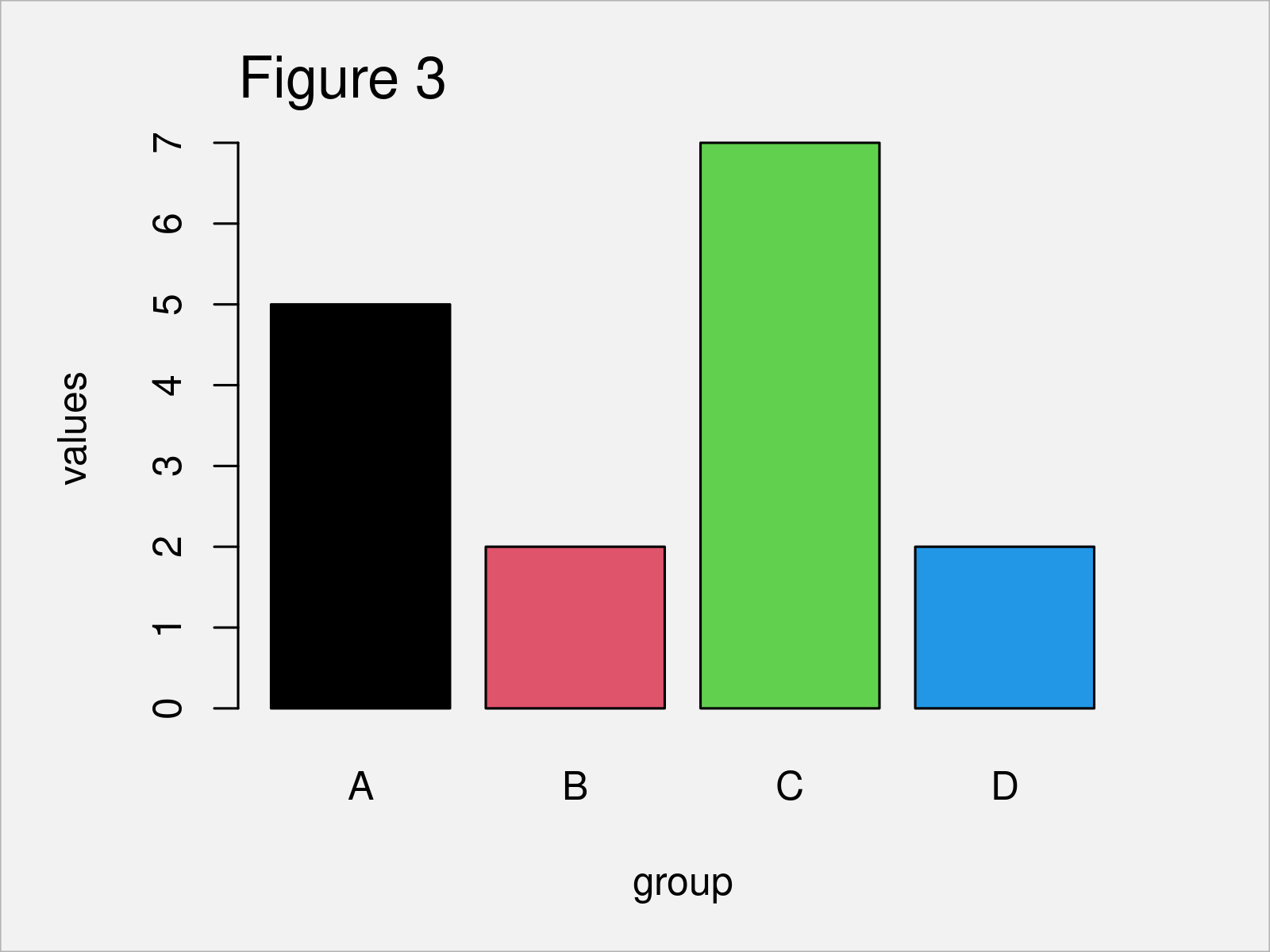
The output of the previous R code is shown in Figure 3: A barplot with a different color in each bar.
If we want to add a legend on top of this barchart, we can apply the legend function as shown below:
legend("topright", # Add legend to barplot df1$group, fill = 1:4) NA |
legend("topright", # Add legend to barplot df1$group, fill = 1:4) NA
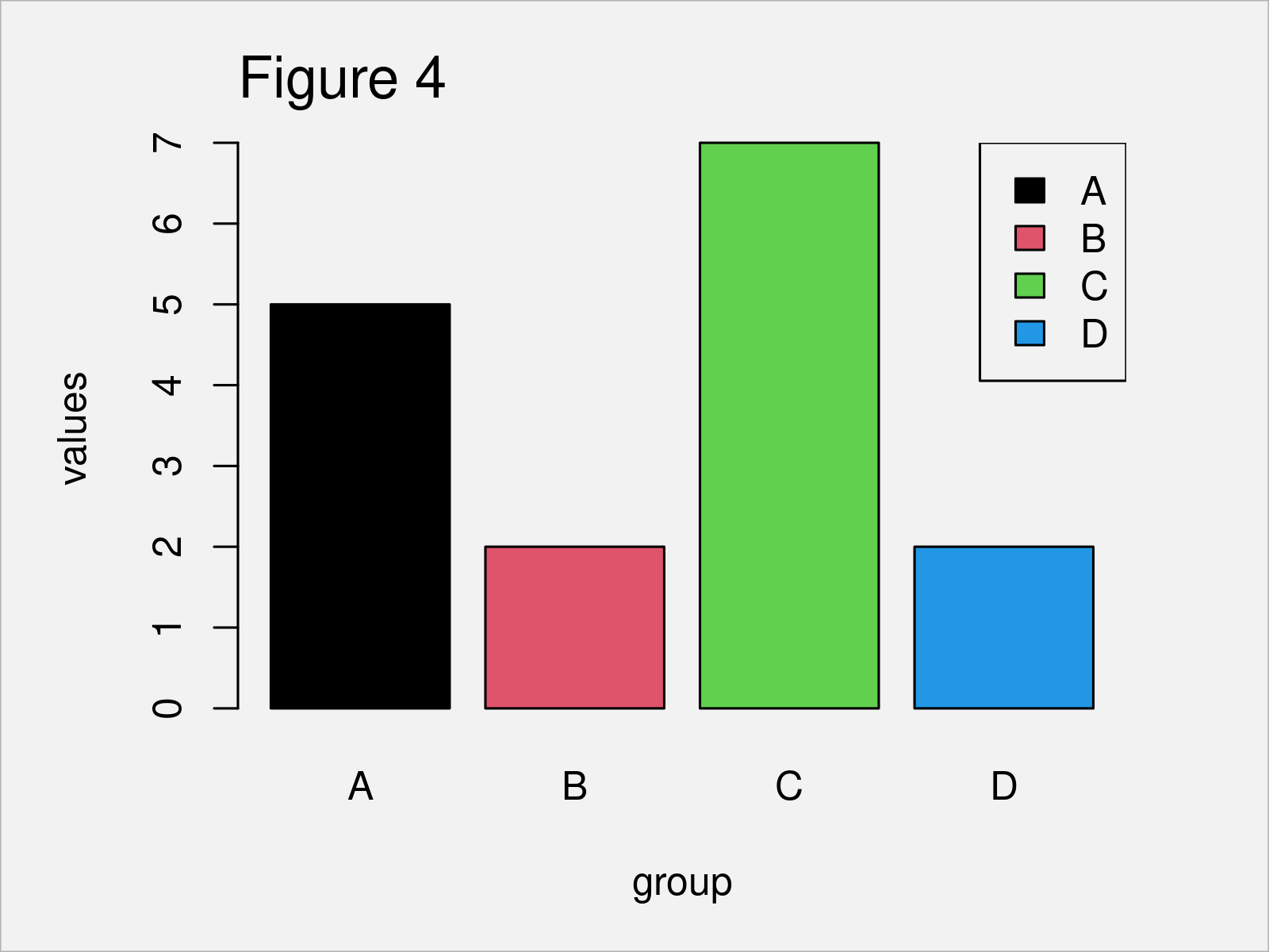
As revealed in Figure 4, the previous R programming syntax has added a legend on top of our Base R barchart.
Base R provides many further options on how to manipulate our barcharts. However, I want to move on to a very common add-on package for graphics in R – the ggplot2 package!
Example 2: Create Barchart Using ggplot2 Package
The following syntax explains how to use the ggplot2 package to draw basically the same types of barcharts as in the previous section.
First, we need to install and load the ggplot2 package:
install.packages("ggplot2") # Install & load ggplot2 library("ggplot2") |
install.packages("ggplot2") # Install & load ggplot2 library("ggplot2")
Next, we can draw a ggplot2 barplot with default setting as shown below:
ggplot(df1, # Draw ggplot2 barplot aes(x = group, y = values)) + geom_bar(stat = "identity") |
ggplot(df1, # Draw ggplot2 barplot aes(x = group, y = values)) + geom_bar(stat = "identity")
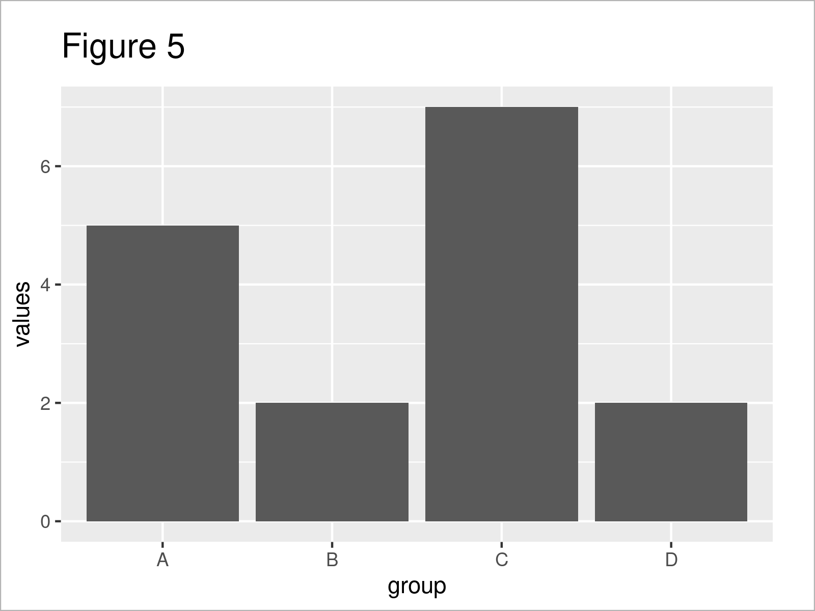
As shown in Figure 5, we have created a vertical barchart without colors by executing the previous R syntax.
If we want to draw a horizontal bargraph, we can apply the coord_flip function as shown below:
ggplot(df1, # Horizontal barplot aes(x = group, y = values)) + geom_bar(stat = "identity") + coord_flip() |
ggplot(df1, # Horizontal barplot aes(x = group, y = values)) + geom_bar(stat = "identity") + coord_flip()
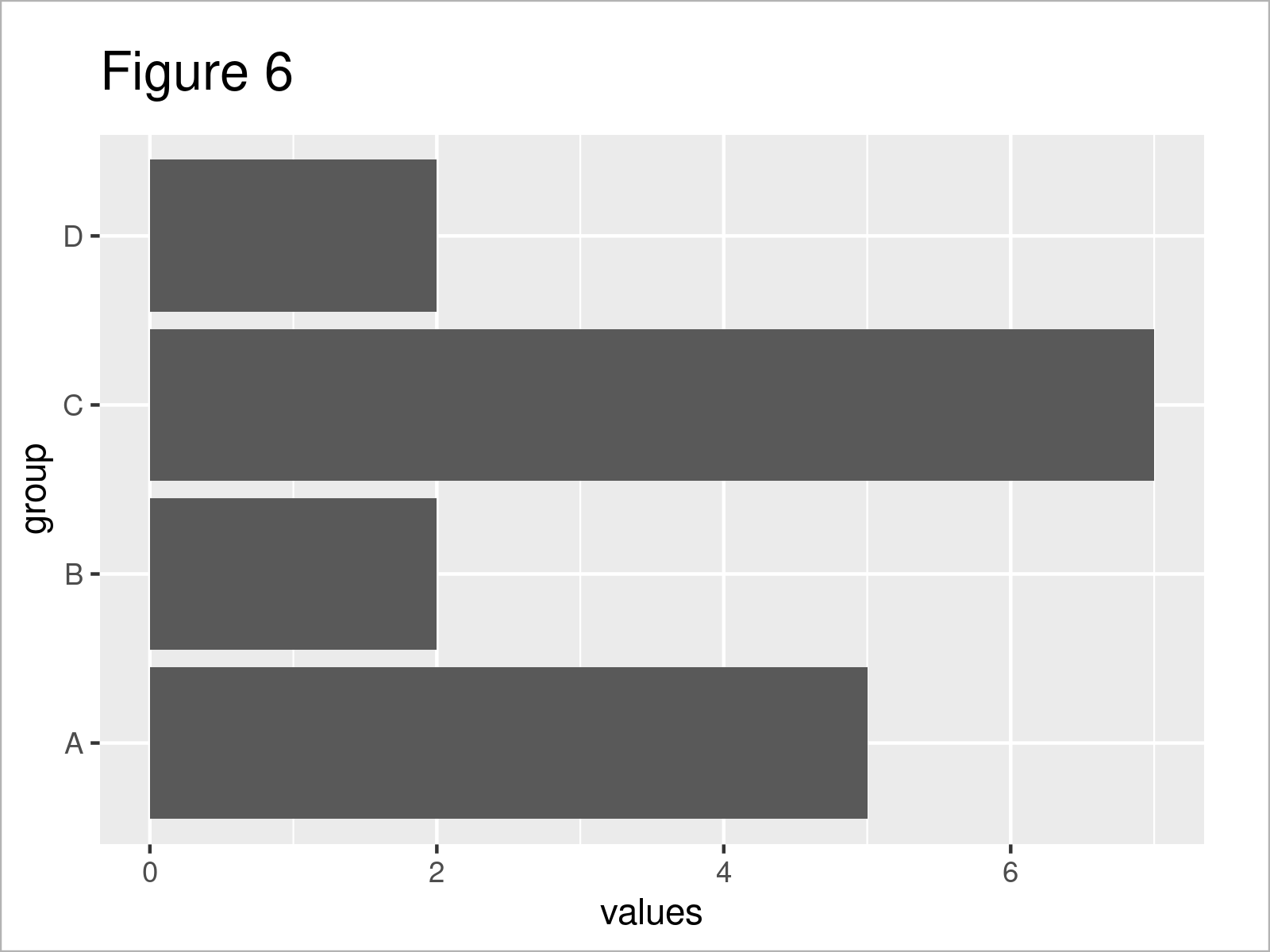
By executing the previously shown R code, we have created Figure 6, i.e. a horizontally aligned bargraph.
We can also add colors and a legend to our barplot by using the fill argument within the aesthetics of our ggplot2 plot:
ggplot(df1, # Barplot with colors aes(x = group, y = values, fill = group)) + geom_bar(stat = "identity") |
ggplot(df1, # Barplot with colors aes(x = group, y = values, fill = group)) + geom_bar(stat = "identity")
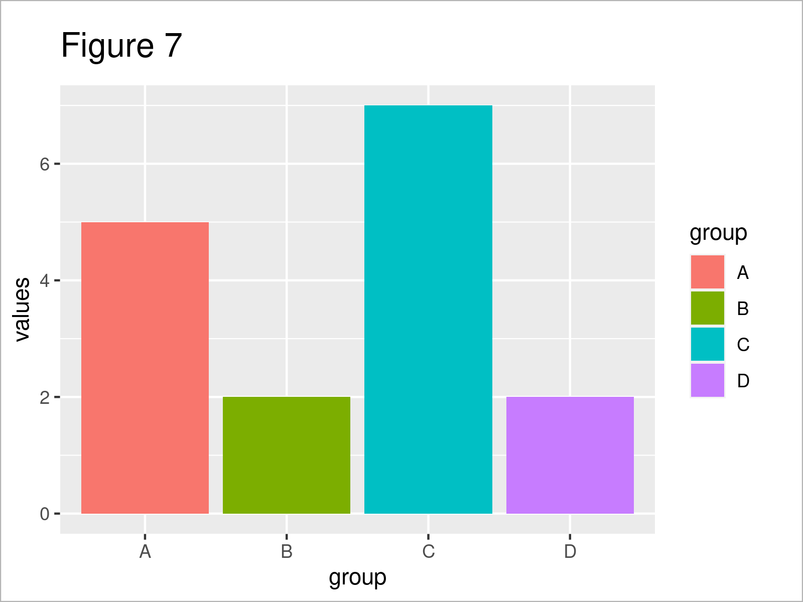
In Figure 7 you can see that we have plotted a colored ggplot2 barplot using the previous R programming syntax.
So far, so good – Let’s draw some more advanced barplots!
Example 3: Create Stacked Barchart Using ggplot2 Package
The following sections explain how to visualize more complex data, i.e. data with main and subgroups, in a barplot.
First, we have to create another data set:
df2 <- data.frame(values = c(3, 2, 6, 3, 4, 3, 8, 2), # Data frame with subgroups maingroup = rep(LETTERS[1:4], each = 2), subgroup = letters[1:2]) df2 # Print new data frame # values maingroup subgroup # 1 3 A a # 2 2 A b # 3 6 B a # 4 3 B b # 5 4 C a # 6 3 C b # 7 8 D a # 8 2 D b |
df2 <- data.frame(values = c(3, 2, 6, 3, 4, 3, 8, 2), # Data frame with subgroups maingroup = rep(LETTERS[1:4], each = 2), subgroup = letters[1:2]) df2 # Print new data frame # values maingroup subgroup # 1 3 A a # 2 2 A b # 3 6 B a # 4 3 B b # 5 4 C a # 6 3 C b # 7 8 D a # 8 2 D b
In the previous console output you can see that we have created another data set with the previous R code. This data set contains three columns, a values column as well as a main and sub group indicator.
We can now visualize these data in a so called stacked barplot, i.e. where the subgroups are plotted on top of each other within the same bar:
ggplot(df2, # Draw stacked barplot aes(x = maingroup, y = values, fill = subgroup)) + geom_bar(stat = "identity") |
ggplot(df2, # Draw stacked barplot aes(x = maingroup, y = values, fill = subgroup)) + geom_bar(stat = "identity")
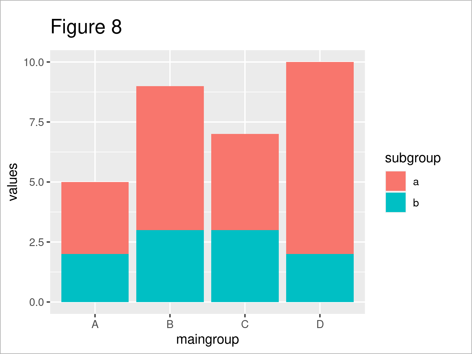
By running the previous syntax, we have created Figure 8, i.e. a stacked ggplot2 barchart.
Example 4: Create Stacked Barchart Scaled to 100% Using ggplot2 Package
To make the comparison between the subgroups more visual, we may scale the bars in our barplot to the same height.
This code demonstrates how to scale all bars to the value 1:
ggplot(df2, # Scale to 1.0 aes(x = maingroup, y = values, fill = subgroup)) + geom_bar(stat = "identity", position = "fill") |
ggplot(df2, # Scale to 1.0 aes(x = maingroup, y = values, fill = subgroup)) + geom_bar(stat = "identity", position = "fill")
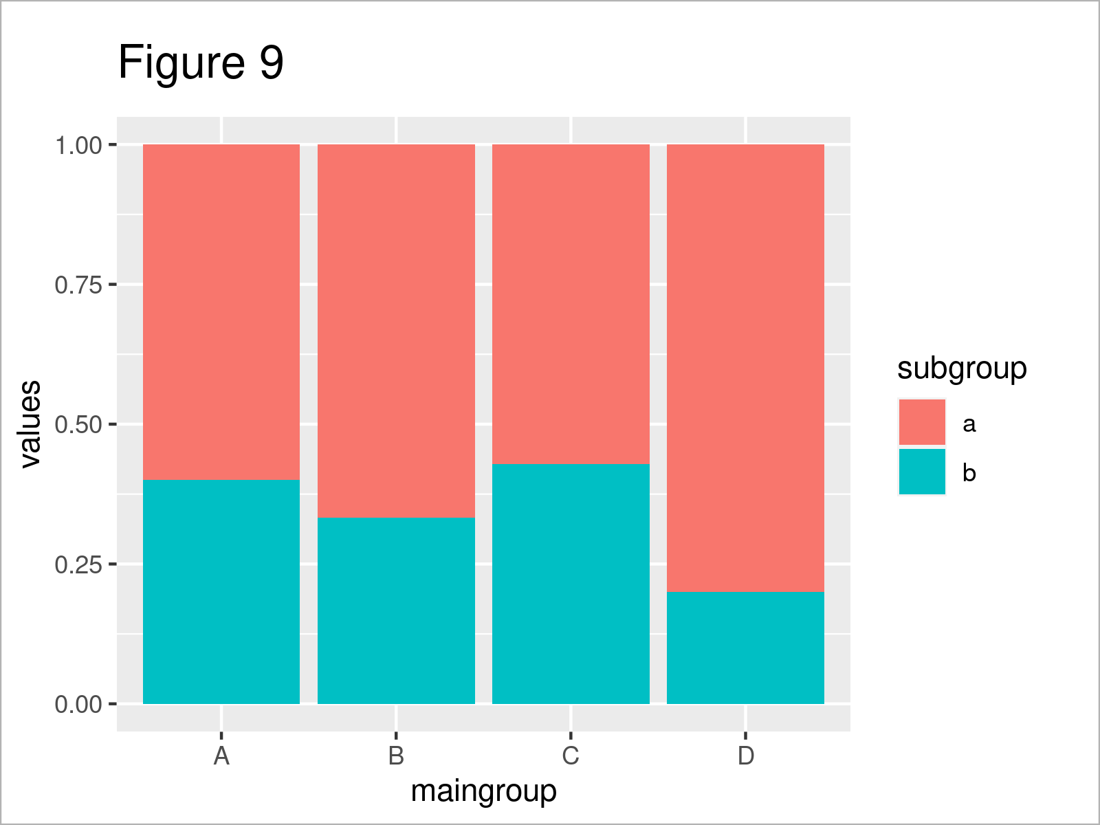
As shown in Figure 9, we have created a barplot scaled to 1.
Alternatively, we may scale all bars to 100%:
ggplot(df2, # Scale to 100% aes(x = maingroup, y = values, fill = subgroup)) + geom_bar(stat = "identity", position = "fill") + scale_y_continuous(labels = scales::percent_format()) |
ggplot(df2, # Scale to 100% aes(x = maingroup, y = values, fill = subgroup)) + geom_bar(stat = "identity", position = "fill") + scale_y_continuous(labels = scales::percent_format())
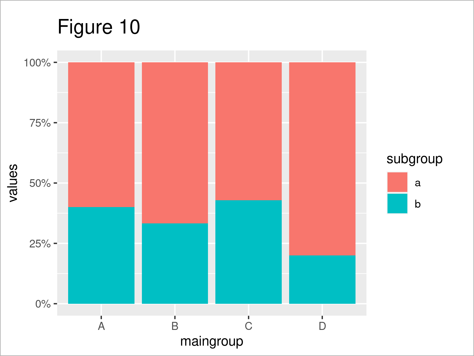
The output of the previous syntax is shown in Figure 10: The stacked bars are exactly the same as in the previous graph. However, the y-axis was changed to percentage points.
Example 5: Create Grouped Barchart Using ggplot2 Package
Another very popular way to visualize subgroups are so called grouped barplots.
We can use the ggplot2 package to draw a grouped barplot as shown below. Note that the following R code specifies the position argument within the geom_bar function to be equal to “dodge”:
ggplot(df2, # Draw grouped barplot aes(x = maingroup, y = values, fill = subgroup)) + geom_bar(stat = "identity", position = "dodge") |
ggplot(df2, # Draw grouped barplot aes(x = maingroup, y = values, fill = subgroup)) + geom_bar(stat = "identity", position = "dodge")
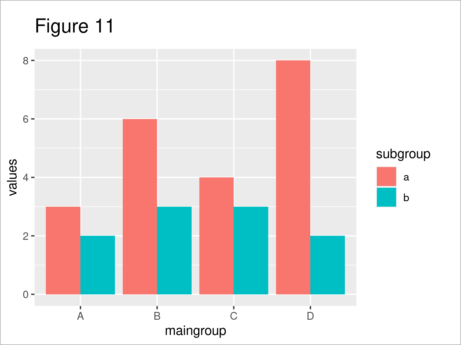
As visualized in Figure 11, the previous R programming code has created a grouped ggplot2 barplot.
Video, Further Resources & Summary
Have a look at the following video that I have produced in collaboration with Wolf Riepl, the founder of the StatistikinDD YouTube channel. I illustrate the R programming codes of this tutorial in the video:

By loading the video, you agree to YouTube’s privacy policy.
Learn more
Wolf Riepl has also created a similar tutorial as the one on this page on his German website. You can find the article here.
Additionally, you might read the other posts on my website. I have published several articles already:
- Draw Barplot with Standard Error Bars in R
- Draw Barplot of Table Object in R
- R Modify Position of geom_text Labels on Dodged Barplot
- Creating Horizontal Barplot in Base R & ggplot2
- How to Modify ggplot2 Barplot Color in R
- Show the Y-Axis of a ggplot2 Barplot in Percentage Points
This article has explained how to draw a barplot in the R programming language. Let me know in the comments, if you have any further questions.
